



Memberships are one of the most dependable revenue streams a service business can build. Clients commit to regular visits, revenue arrives on a predictable schedule, and members tend to stay longer than clients who book one appointment at a time. But a membership program is only as strong as your ability to see how it’s performing. Most operators know their total membership revenue. Far fewer can say which plans are growing, which are losing members, and where new sign-ups are coming from.
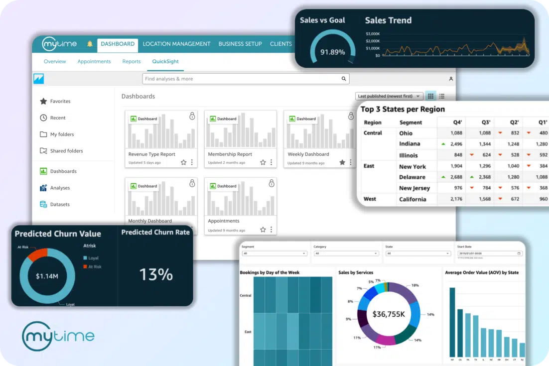
For franchise brands, the challenge multiplies. Every location runs its own version of the program, and the numbers that matter most are spread across separate reports and separate accounts. The MyTime Dashboard already gives franchise operators one place to track revenue, bookings, services, clients, and staff productivity across their locations. The new Memberships view adds the recurring side of the business to that picture. This article covers the metrics that show whether a membership program is healthy, and how the Memberships view brings them together for one location or an entire network.
What Metrics Show Whether a Membership Program Is Healthy?
Four numbers tell you most of what you need to know: membership revenue, active members, new memberships, and cancellations.
- Membership revenue shows what the program actually brings in. Know exactly what your revenue figure includes, such as sales, fees, and cancellation charges, so every period is measured the same way.
- Active members shows the size of your program at a point in time. Measuring it on the last day of a period gives a consistent snapshot you can compare month to month.
- New memberships shows whether the program is growing. Renewals should be counted separately, since a renewal is retention, not acquisition.
- Cancellations shows how many members you’re losing, including memberships that expire without renewing.
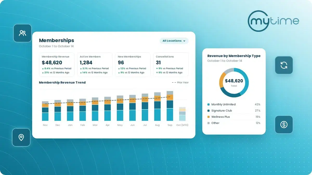
None of these numbers means much on its own. Revenue that’s up 5% sounds good until you see it was up 15% at the same time last year. That’s why comparisons matter as much as the metrics themselves. Looking at each number against the previous period and against the same period a year earlier separates real trends from seasonal noise. In the Memberships view on the MyTime Dashboard, each of these four metrics has its own tile, with both comparisons shown under the figure.
Why Is Membership Performance Hard to Track?
Mostly because membership data tends to be scattered. Sales live in one report, recurring charges in another, and member counts and cancellations somewhere else. Pulling them into one picture usually means exporting several reports and building the comparison by hand.
That effort has a cost. When reviewing membership performance takes an afternoon, it happens quarterly instead of monthly. By the time a drop in sign-ups or a rise in cancellations shows up, it has been building for a while.
How Do You Know Which Membership Plans Are Working?
Break performance down by plan. Total membership revenue can hide a lot. One strong plan can mask two that are slowly losing members, and a plan with steady revenue may be relying on a shrinking base of long-time members.
For each membership plan, look at:
- Revenue and its share of total membership revenue
- Active members
- The revenue trend over the past 12 months
- Change compared to the prior month
- How new members are joining
With that view, the decisions get clearer. A plan with growing revenue and steady sign-ups is worth promoting. A plan with flat revenue and few new members may need repricing or retiring. A plan that sells well online but rarely at the front desk may need better staff training.
On the MyTime Dashboard, the Memberships view includes a Revenue by Membership Type chart showing each plan’s share of membership revenue, and the Membership Performance by Type table gives each plan its own row with revenue, member counts, a 12-month trend, and the change against one month ago.
Where Are Your New Members Coming From?
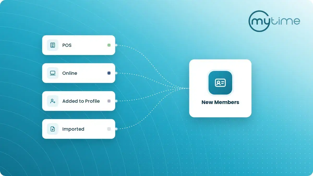
Once you know which plans are working, the next question is how members are joining them. In the Memberships view on the MyTime Dashboard, every new membership is attributed to one of four sources:
- **POS:** sold at the front desk
- Online: purchased by the client online
- Added to Profile: added by staff on the client’s profile
- Imported: brought in through a data import
Tracking that mix shows which parts of your business are actually selling memberships. If most growth comes from the front desk, your staff are your main sales channel, and training and incentives matter. If online sign-ups are climbing, your booking experience is doing real work. Either way, knowing the mix tells you where to invest.
How Can You Spot Membership Churn Before It Grows?
Growth is only half the picture. To spot churn early, watch cancellations and active members together, over time. A single month of higher cancellations may be noise. Three months of rising cancellations alongside a flat or falling active member count is a pattern.
Monthly trend charts make that pattern visible, and a trend for each membership plan shows whether churn is spread across the program or concentrated in one plan. Comparing each month to the same month a year earlier shows whether a dip is seasonal or new. In the Memberships view on the MyTime Dashboard, the Cancellations and Active Members tiles show both comparisons at a glance, and the Active Members Trend chart tracks member counts month by month against the prior year.
The earlier you see a retention problem, the more options you have, whether that means adjusting plan benefits, reaching out to at-risk members, or reviewing how cancellations are handled at specific locations.
How Do Franchise Brands Track Memberships Across Locations?
They need two views at once: the whole network and each individual location. Brand leaders want to know how the program is performing overall, and which locations are driving growth or need support. That takes reporting that rolls up across every location and filters down to just one.
On the MyTime Dashboard, brand leaders can open the Memberships view for all locations at once or filter to a single location, while staff with access to one location see only that location’s data.
How MyTime Shows Membership Performance
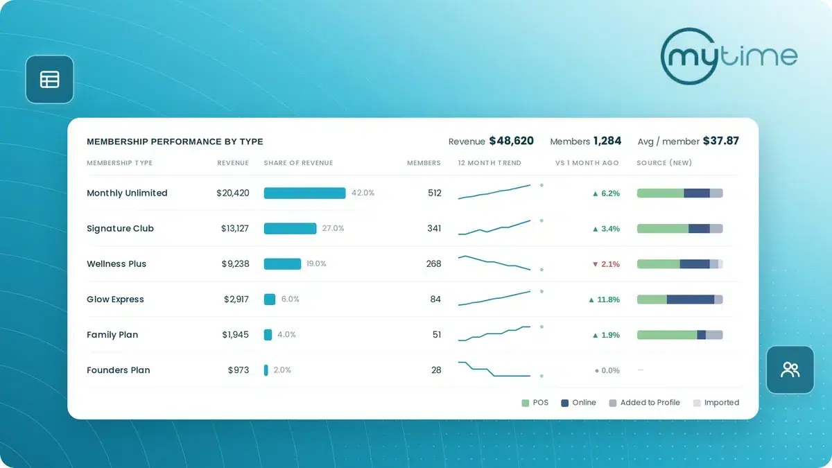
The Memberships view on the MyTime Dashboard brings all of these metrics together, for a single location or across all of them.
Headline tiles show Membership Revenue, Active Members, New Memberships, and Cancellations, each compared to the previous period and to 12 months ago, with color-coded arrows that show whether the change is good or bad for your business.
Trend charts show membership revenue and active members month by month against the same months last year. An incomplete current month is labeled month to date, so a partial month isn’t mistaken for a decline.
Donut charts and the performance table break the program down by plan and by acquisition channel, so you can see which memberships are carrying the program and how new members are joining.
Book a Demo to see the Memberships view with your own membership program in mind.
Frequently Asked Questions
What is the most important metric for a membership program?
No single metric tells the full story. Membership revenue, active members, new memberships, and cancellations work best together, compared against the previous period and the same period last year.
What’s included in membership revenue?
In the Memberships view on the MyTime Dashboard, Membership Revenue is revenue from closed tickets for membership fees, sales, and cancellation charges. Freeze fees, refunds, and failed charges are excluded.
What counts as a cancellation?
In MyTime’s Memberships view, Cancellations counts memberships that were canceled or expired within the selected date range.
Are renewals counted as new memberships?
No. New Memberships counts newly acquired memberships in the selected date range, whether sold at POS, purchased online, added to a client’s profile, or imported.
Can franchise brands see membership performance across all locations?
Yes. On the MyTime Dashboard, brand-level users can open the Memberships view for all locations at once or filter to one, and staff with access to a single location see only their own location’s data.
How can I tell which membership plan is performing best?
In the Memberships view on the MyTime Dashboard, the Revenue by Membership Type chart shows which plans bring in the most revenue, and the Membership Performance by Type table gives each plan its own row with its revenue, member count, a 12-month trend line, and change against one month ago.